Museums rebrand for many reasons, but whatever the motive, it is a process that allows organisations to redefine themselves as they seek to stay relevant.
Rebranding is a way to clarify an institution’s identity and values, making it clearer to the public what it stands for and why it matters.
A rebrand can also boost visibility and attract broader audiences. By updating their branding, messaging and approach, museums can reach younger generations, diverse communities, under-represented groups
and those who don’t engage with history or art in traditional settings.
A new identity can make a museum more relatable and show its commitment to issues such as sustainability, inclusivity and social justice.
Museums facing criticism, meanwhile, might welcome the opportunity that a rebrand brings to adopt a more positive, forward-looking image.
Moreover, a revitalised brand might also be more appealing to donors.
Advertisement
But rebrands are not without risk, particularly when people feel a brand’s heritage is at stake.
London calling
London Museum, formerly the Museum of London, made a splash – or should that be splat? – when it revealed its new name last summer. Joining the new name was a radically different symbol – a pigeon with a shiny poo. It certainly got people talking.
Josh Green, the museum’s head of design, says: “The opening of our new museum in Smithfield in 2026 is a transformational moment and gives us an opportunity to reimagine what a city museum looks like in the 21st century. We want to reach new audiences and bring in more visitors than ever before – and need a brand that can help us realise these ambitions.”
Becoming London Museum in July 2024 gave the team two years to build brand recognition before the museum’s opening.
The rebranding process took two-and-a-half years, with lots of consultation and input from staff, visitors and locals. The institution’s 2020 brand framework guided decision-making.
Advertisement
During the framework’s development, the museum partnered with brand strategist Something More Near to gather insights from Londoners from all boroughs and backgrounds. It also took part in the Smithfield 150 festival, taking over a local shop for a two-week residency and inviting people to share their ideas and shape the framework.
At its heart are five principles: Put on a Great Show; Contrast and Connect; Take Good Care; Keep Your Feet on the Street; and The Doors Stay Open.
“These principles have served as benchmarks throughout the development of our brand and identity, ensuring that every decision aligns with our commitment to accessibility, engagement and showcasing our collections,” says Green.
Working with London-based agency Uncommon Creative Studio on the brand development gave the museum staff working on the project a valuable outside perspective. Green acted as a bridge between Uncommon and the museum, ensuring consistency as the museum team began rolling out the brand identity.
Fostering creative collaboration with Londoners was essential. An interactive installation at the museum’s London Wall site asked staff and visitors about the mark they had made on London. The team held workshops with groups such as schoolchildren to identify key themes.
Extensive consultation, audience testing and research before rollout ensured that the identity was “baked” into the museum ahead of its launch. Green emphasises the need for “careful communication and collaboration to bring everyone along”.
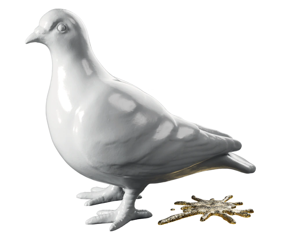
London Museum also worked with an access consultant to ensure the brand was inclusive. The pigeon logo broke the traditional museum branding mould.
Advertisement
Made with clay from the river Thames and moulded by the hands of a Londoner, the pigeon couldn’t be more “London”, says Green.
“It embodies our dualities – the grit and the glitter of London,” he says. “It is a humble icon of city life; witnessing London life with no judgement. It’s a reflection of how we see ourselves and the museum’s role.”
The brand identity needed to be timeless and adaptable across print and digital. The museum’s bespoke and bold London Hand typeface also embodies this flexibility.
“The brand and identity is an ongoing learning exercise – it will continually evolve and grow,” says Green. “Success will be measured by our ability to engage new audiences. This isn’t just about our new home at Smithfield. Our brand must resonate as strongly at our existing Docklands site and online. Ultimately, the rebrand should establish London Museum as a vibrant, central hub.”
Young at heart
Design consultancy Pentagram has worked with many large museums to reimagine their brands, including a new identity for London’s Natural History Museum in 2023.
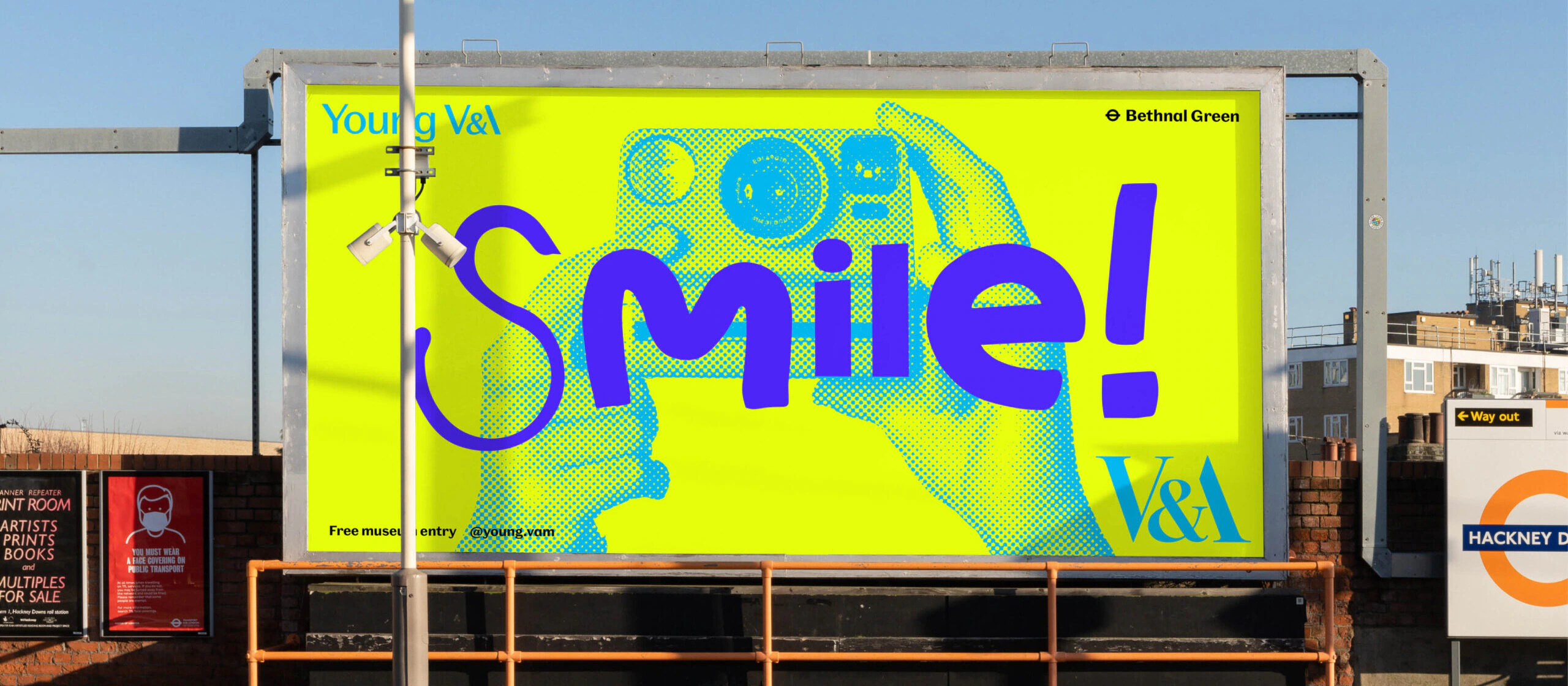
Pentagram partner Marina Willer also worked on the rebrand of the V&A Museum of Childhood to the Young V&A. The brand had to appeal to an audience spanning a range of ages and cultural backgrounds.
The new name invites playfulness and participation. Pentagram mixed the museum’s custom Spiller typeface with handmade characters, creating a lively and dynamic style.
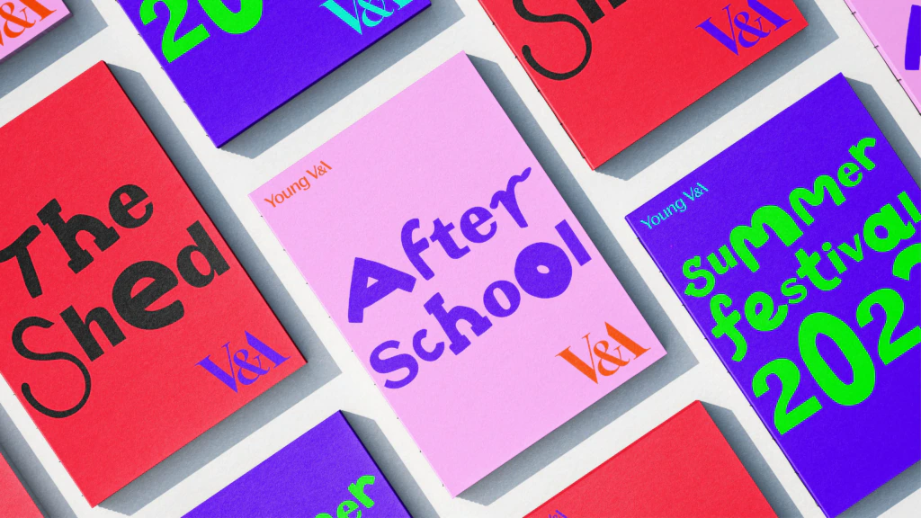
“The type is one of the fundamental tools that we have in a brand,” says Willer. “We literally hacked the font that they had designed – with permission.”
The rebrand plays with the classic V&A logo designed by former Pentagram partner Alan Fletcher. Joyful colours, illustrations and eye-catching photography express a “younger, more inclusive, diverse and participative” approach. Motion-based applications mix the letters in a stop-motion style, animating the museum.
Taking stock
Over the years, the London Transport Museum’s brand architecture had developed alongside its programming, with bespoke sub-brands for its Interchange thought leadership initiative, Hidden London tours and Enjoyment to Employment, a programme to tackle the skills shortage in the transport sector.
Yet research showed that customers didn’t always realise that the museum was delivering these experiences.
When Elizabeth McKay became the museum’s director and chief executive in 2023, it was the perfect time to review the brand.
“Our rebrand has brought our teams together to re-articulate our purpose through a unified narrative and visual identity, so that no matter what element of our programming people engage with, we’re all on the same journey,” she says.
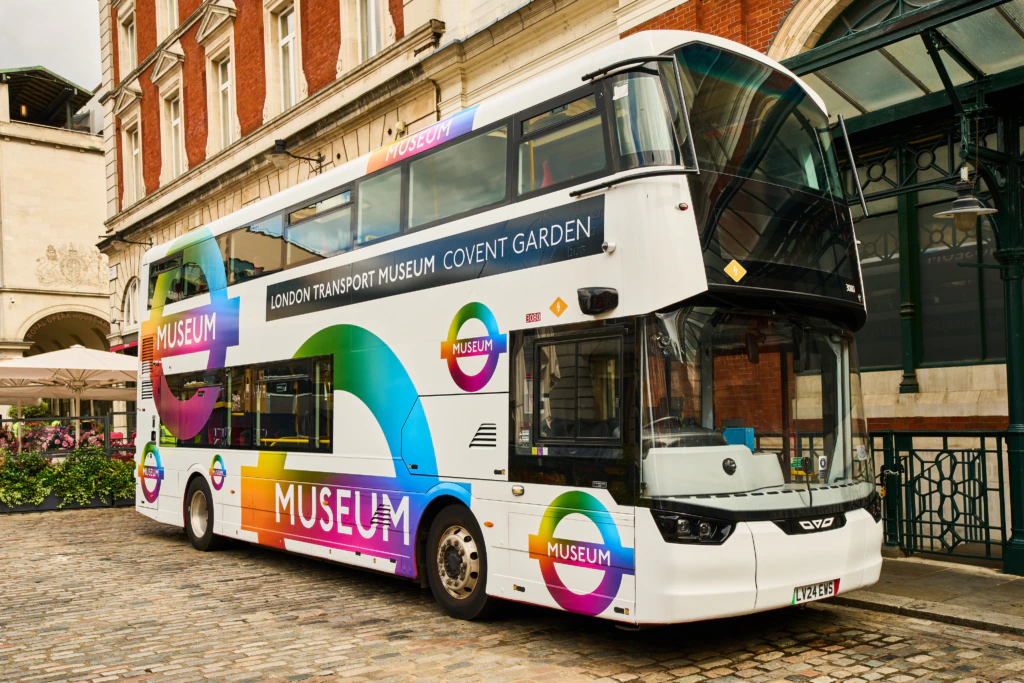
The team set an ambitious timeline. It held its first internal workshop in May 2023, launched a brand awareness campaign in February 2024 and unveiled the new roundel, which taps into London Transport’s design heritage, in July.
“It reimagines this iconic 100-year-old marque, adopting a bold, multi-coloured spectrum design that ensures the museum fits into the Transport for London ‘family’, while also standing out as a leading visitor attraction,” says McKay.
“For us, it represents the vibrant transport history and the story of innovation and ingenuity waiting to be discovered in our galleries.”
An in-house rebrand enabled the museum to control the timeline and costs.
“A rebrand can be a daunting endeavour and bringing in external support can be helpful, but I’m a big advocate for making the most of your organisation’s expertise,” says McKay.
“You and your teams know your brand best. You know your history, your heritage and what your organisation means to visitors because you’re talking to them every day. We found huge value in giving ourselves the time and space to step back and refocus on the story we wanted to share through our brand.”
Starting from scratch
Before 2021, St Andrews Heritage Museum and Garden had neither a brand nor a dedicated website. It had the same name and branding as the St Andrews Preservation Trust charity.
But a £5,600 project, funded through the Museums Galleries Scotland Recovery and Resilience Fund, changed all that. Samantha Walker, the museum’s manager, says the trust’s name sometimes led people to believe the museum was private. Its location in a house could also make people hesitant to enter. Walker wanted to highlight the museum’s public-facing activities and rich heritage – and make it easier for visitors to engage with them.
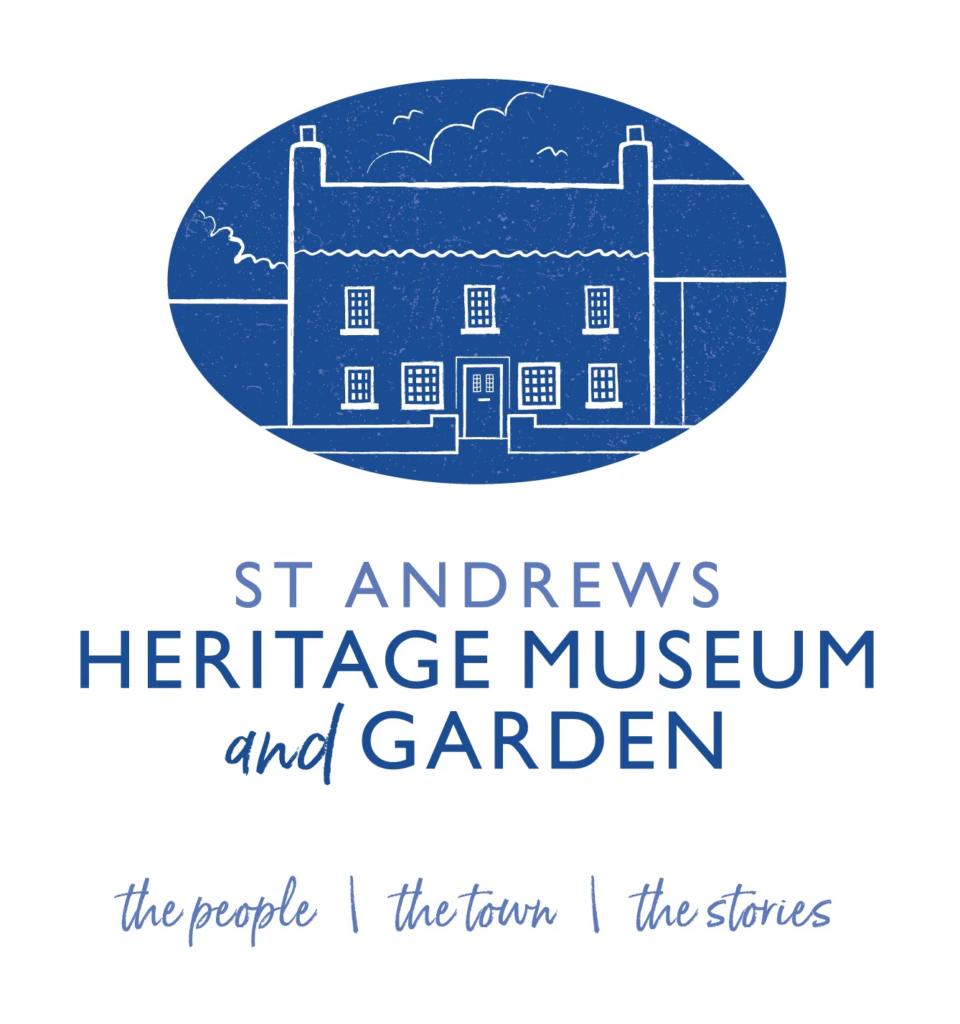
The team started with the name, knowing the logo would follow from that. They gathered suggestions and feedback from staff, volunteers, trustees, museum consultants and visitors.
Walker says she found working with Dundee-based design, marketing and communications agency the Malting House helpful, as it brought fresh perspectives and facilitated discussions. She says it soon became clear that keeping “St Andrews” was a must.
Although there was some resistance to the rebrand, Walker says everyone eventually felt comfortable with the new name. To maintain continuity, the St Andrews Heritage Museum brand uses a similar colour scheme to the trust.
The logo is inspired by woodcuts in the museum’s collection by Scottish artist Annabel Kidston.
The project provided the St Andrews Heritage Museum with a foundation for its plans, including its reopening after a refurbishment later this year.
These projects show that a rebrand is more than a visual refresh. It is a chance to reflect and set a clear future direction with a new identity that aligns with a museum’s vision, values and audiences.
Juliana Gilling is a freelance journalist