Berthold Wolpe was a curious man, in that he was filled with curiosity. He spent his life packing his brain with ideas and knowledge, and his home with all sorts of things. He was a true collector and his magpie nature added much to his designs.
Wolpe was a font and graphic designer, and lettering artist, who left a mark on 20th-century graphic design. If you have ever wandered in the City of London, you will know Albertus, the typeface he created, which is still seen on street signs there.
You may also be familiar with some of the 1,500 book covers he designed for Faber. But what nobody has seen – and what makes this exhibition and accompanying book so special – is the wealth of hand-drawn artwork, which holds the key to Wolpe’s style.
Developed in conjunction with Wolpe’s family, the exhibition will shed light on the designer’s personality. The gallery will be filled with beautiful handcrafted artwork, including designs for signs and maps, alongside many of the original Faber covers, complete with white correcting paint refining the hand-drawn black lettering. The show will reflect the character of the man and create a palpable feeling of the chaotic conditions in which he worked. Visitors should feel as if they have met this master of typographic design. Poignantly, Wolpe’s coat will hang on the back of the gallery door, and cigarette tins will overflow with writing tools and the individually-cut paper letters he always carried.
The book that accompanies the show is full of anecdotes from Wolpe’s friends, admirers, colleagues and family. One story describes a time when he turned up at the Faber offices for a meeting and was met by his then boss, TS Eliot. Wolpe had brought his baby in a pram, which he handed to arguably the greatest poet of the 20th century and remarkably asked him to take care of it while Wolpe got on with his business.
The abundance of hand-drawn work and handheld tools on display will illustrate a time before computers, and illuminate the somewhat homogenised design we see now as a result of technology. When Wolpe learned his craft, he was taught to work to the limits of his own mind rather than rely on any preconfigured computer software.
One illustration of this is Albertus, which became one of the most widely used typefaces in the UK. What sets it apart from other fonts are the quirks that reflect its original creation – it was cut by Wolpe for some bronze inscriptions rather than being designed specifically as a font.
It is that human element and the idiosyncrasies of Wolpe’s designs that give them vitality and power, and that is what I think we miss in typography and design today. Wolpe thought similar back in 1982, saying: “Modern electronic methods are only tools for reproducing something. Photo typesetting is probably hurting typography only through the fact that people don’t know the basic conditions and rules of design.”
I hope exposure to Wolpe’s work will inspire students of design to close their computers and create work that carries something of their own DNA as opposed to that of their Mac.
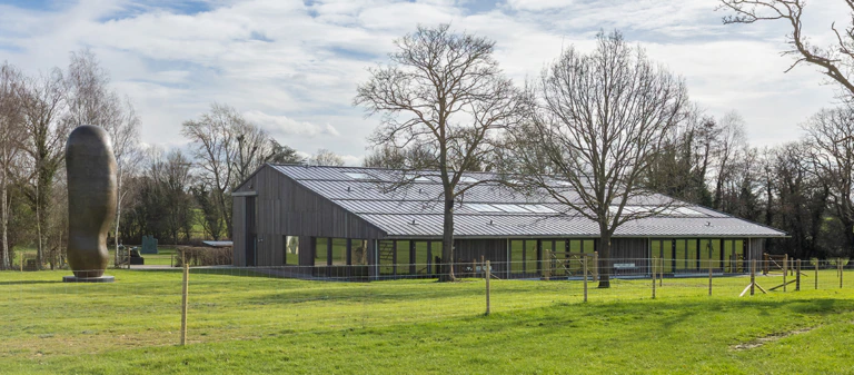
Phil Cleaver is the guest curator of Berthold Wolpe – The Total Man, and the author of the book. The exhibition is on at the Lettering Arts Centre in Snape Maltings, Suffolk, from 23 March to 24 June
Wolpe was a font and graphic designer, and lettering artist, who left a mark on 20th-century graphic design. If you have ever wandered in the City of London, you will know Albertus, the typeface he created, which is still seen on street signs there.
You may also be familiar with some of the 1,500 book covers he designed for Faber. But what nobody has seen – and what makes this exhibition and accompanying book so special – is the wealth of hand-drawn artwork, which holds the key to Wolpe’s style.
Developed in conjunction with Wolpe’s family, the exhibition will shed light on the designer’s personality. The gallery will be filled with beautiful handcrafted artwork, including designs for signs and maps, alongside many of the original Faber covers, complete with white correcting paint refining the hand-drawn black lettering. The show will reflect the character of the man and create a palpable feeling of the chaotic conditions in which he worked. Visitors should feel as if they have met this master of typographic design. Poignantly, Wolpe’s coat will hang on the back of the gallery door, and cigarette tins will overflow with writing tools and the individually-cut paper letters he always carried.
The book that accompanies the show is full of anecdotes from Wolpe’s friends, admirers, colleagues and family. One story describes a time when he turned up at the Faber offices for a meeting and was met by his then boss, TS Eliot. Wolpe had brought his baby in a pram, which he handed to arguably the greatest poet of the 20th century and remarkably asked him to take care of it while Wolpe got on with his business.
The abundance of hand-drawn work and handheld tools on display will illustrate a time before computers, and illuminate the somewhat homogenised design we see now as a result of technology. When Wolpe learned his craft, he was taught to work to the limits of his own mind rather than rely on any preconfigured computer software.
One illustration of this is Albertus, which became one of the most widely used typefaces in the UK. What sets it apart from other fonts are the quirks that reflect its original creation – it was cut by Wolpe for some bronze inscriptions rather than being designed specifically as a font.
It is that human element and the idiosyncrasies of Wolpe’s designs that give them vitality and power, and that is what I think we miss in typography and design today. Wolpe thought similar back in 1982, saying: “Modern electronic methods are only tools for reproducing something. Photo typesetting is probably hurting typography only through the fact that people don’t know the basic conditions and rules of design.”
I hope exposure to Wolpe’s work will inspire students of design to close their computers and create work that carries something of their own DNA as opposed to that of their Mac.
Phil Cleaver is the guest curator of Berthold Wolpe – The Total Man, and the author of the book. The exhibition is on at the Lettering Arts Centre in Snape Maltings, Suffolk, from 23 March to 24 June