Literature has often provided inspiration for museum curators as well as artists. But the challenge that the former face is how to make books, poems and manuscripts interesting in their own right for visitors.
The answer seems to lie in embracing the natural interchange between words and visuals. The 20 Years of Penguin Essentials exhibition at the Ditchling Museum of Art + Craft in East Sussex, which runs until 29 April, brings together 100 eye-catching book covers. John Hamilton, the art director of Penguin Random House UK, launched the Penguin Essentials series in 1998 to revamp modern classics with help from typographers, fashion designers, graffiti artists (including Banksy) and even tattooists.
Hamilton says the best kind of cover art offers “an interpretation of the text that is engaging and seductive”. With the Penguin Essentials collection, the artists had creative freedom and weren’t even given a brief to adhere to. From a skeleton sporting a jaunty bowler hat and white shirt while holding a jar of milk for A Clockwork Orange, to a minimalistic red and black illustration for In Cold Blood, and a character breakdown for the Great Gatsby, the result is aesthetically pleasing covers that engage and seduce, as well as representing the material in their pages.
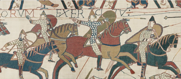
While the challenge of how to display books is only an occasional problem for some, the nature of the British Library, London, means book display is a constant in its exhibition programme. Harry Potter: A History of Magic ran at the library until the end of February. The key to making it a success was to avoid featuring long runs of books, says its lead curator Julian Harrison, and to play on the senses without overloading them. “The visual imagery has to be chosen not for its own sake, but because it adds to the overall story,” he says. “Manuscripts and books can be magical objects, but much depends on how you display them and how they fit the narrative.”
For example, Leonardo da Vinci’s notebook was displayed in the astronomy section of the show, alongside an Arabic astrolabe and the oldest surviving chart of the night sky, which was made in China around AD700. Although these are tangible objects, often when we read our mind creates the visuals for us.
This is especially the case with poetry and is something that a collaboration between the author Robert Macfarlane and the artist and author Jackie Morris aims to illuminate in the exhibition, The Lost Words. First shown at Compton Verney Art Gallery in Warwickshire, the show has begun a national tour, starting at London’s Foundling Museum until 6 May. Macfarlane has written 20 acrostic or “spell” poems, which target words that are fading out of our vocabulary, as the exhibition wants to connect children – as well as adults – with nature.
Morris’s watercolour illustrations of mischievous sea otters, regal owls and prickly conkers lend themselves to Macfarlane’s prose, both of which can be revisited in the book, The Lost Words: A Spell Book, which accompanies the show. Antonia Harrison, a curator at Compton Verney, says she took advantage of the museum’s high ceilings with a “combination of the artwork and large-scale wallpapers of the works to give the sense of walking into a book”.
Other museums are also curating exhibitions that bring literature alive. Turner Contemporary in Kent is showing Journeys With the Waste Land based on TS Eliot’s poem The Waste Land, and Tate St Ives has staged an exhibition inspired by Virginia Woolf’s writings. All these shows are encouraging audiences to explore literature in innovative new ways.
Laura Rutkowski is a freelance writer
The answer seems to lie in embracing the natural interchange between words and visuals. The 20 Years of Penguin Essentials exhibition at the Ditchling Museum of Art + Craft in East Sussex, which runs until 29 April, brings together 100 eye-catching book covers. John Hamilton, the art director of Penguin Random House UK, launched the Penguin Essentials series in 1998 to revamp modern classics with help from typographers, fashion designers, graffiti artists (including Banksy) and even tattooists.
Hamilton says the best kind of cover art offers “an interpretation of the text that is engaging and seductive”. With the Penguin Essentials collection, the artists had creative freedom and weren’t even given a brief to adhere to. From a skeleton sporting a jaunty bowler hat and white shirt while holding a jar of milk for A Clockwork Orange, to a minimalistic red and black illustration for In Cold Blood, and a character breakdown for the Great Gatsby, the result is aesthetically pleasing covers that engage and seduce, as well as representing the material in their pages.
While the challenge of how to display books is only an occasional problem for some, the nature of the British Library, London, means book display is a constant in its exhibition programme. Harry Potter: A History of Magic ran at the library until the end of February. The key to making it a success was to avoid featuring long runs of books, says its lead curator Julian Harrison, and to play on the senses without overloading them. “The visual imagery has to be chosen not for its own sake, but because it adds to the overall story,” he says. “Manuscripts and books can be magical objects, but much depends on how you display them and how they fit the narrative.”
For example, Leonardo da Vinci’s notebook was displayed in the astronomy section of the show, alongside an Arabic astrolabe and the oldest surviving chart of the night sky, which was made in China around AD700. Although these are tangible objects, often when we read our mind creates the visuals for us.
This is especially the case with poetry and is something that a collaboration between the author Robert Macfarlane and the artist and author Jackie Morris aims to illuminate in the exhibition, The Lost Words. First shown at Compton Verney Art Gallery in Warwickshire, the show has begun a national tour, starting at London’s Foundling Museum until 6 May. Macfarlane has written 20 acrostic or “spell” poems, which target words that are fading out of our vocabulary, as the exhibition wants to connect children – as well as adults – with nature.
Morris’s watercolour illustrations of mischievous sea otters, regal owls and prickly conkers lend themselves to Macfarlane’s prose, both of which can be revisited in the book, The Lost Words: A Spell Book, which accompanies the show. Antonia Harrison, a curator at Compton Verney, says she took advantage of the museum’s high ceilings with a “combination of the artwork and large-scale wallpapers of the works to give the sense of walking into a book”.
Other museums are also curating exhibitions that bring literature alive. Turner Contemporary in Kent is showing Journeys With the Waste Land based on TS Eliot’s poem The Waste Land, and Tate St Ives has staged an exhibition inspired by Virginia Woolf’s writings. All these shows are encouraging audiences to explore literature in innovative new ways.
Laura Rutkowski is a freelance writer