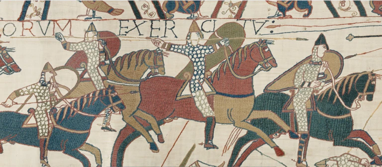
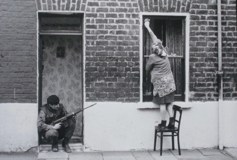
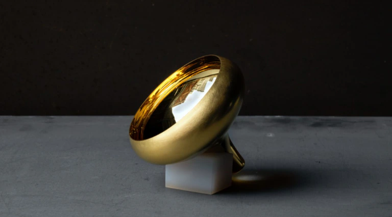
A short story by Tracy Chevalier. A photo-essay on Martin Parr's postcard collection. A lively lunch date with Gordon Ramsay, photographed by Juergen Teller. Alain de Botton writing on the theme of sadness in Edward Hopper's paintings. The 1960s revisited by Don McCullin, Peter Blake and their contemporaries. And a Byzantine recipe for oysters.
Upmarket Sunday supplements, Vanity Fair, Granta, Prospect? No. These are all offerings from the summer editions of the magazines produced by the V&A, the Royal Academy of Arts, the Tate - and Medieval History magazine, which is produced in association with the Royal Armouries museums.
New on the block is the Tate's magazine, relaunched as Tate Etc. It's a handsome beast, perfect-bound with a strikingly trendy cover. The new-look magazine has been produced in-house, after an unsuccessful attempt to farm it out to the contract publishing wing of Conde Nast, home to the likes of Vogue. But even though the experiment failed, it shows that when it comes to magazines, our flagship museums are aiming very up-market indeed.
Tate Etc will be complemented by a separate listings magazine, explains the editor Simon Grant. 'There are no reviews, previews or listings in Tate Etc. We want to break away from what everyone else is doing, and make the magazine something the reader will want to keep.'
Signposting what's happening in the Tate's four venues is a key aim, says Grant, but at the same time, he hopes to go way beyond that. 'We are also trying to promote good writing and deal with difficult stuff. In the next issue, we have Virginia Ironside writing about Gwen John and the emotional issues surrounding her work.'
But why does a museum need a magazine? It seems that no organisation these days, from charities to tourist boards, feels complete without some kind of publication.
Some are excellent, some go straight in the bin. 'Even newspapers are so magazine-driven today, you can see why everyone feels the need to produce something glossy and shiny,' says Charlotte Mullins, the editor of the V&A magazine, which relaunched last year.
She believes her magazine is an extremely appropriate way to highlight the work of the V&A. 'It's very important for museums and institutions to communicate with the people who support them: our magazine provides a benefit to members and a voice for the museum beyond south Kensington.'
Should every museum have a magazine? 'If you are communicating with members and giving something back to the museum, then yes. But I don't think museums should spend any of their budget on producing magazines. It's important that publications should be self-funding. All money that is given to the V&A goes to the museum [not the magazine].'
A well-produced, professional magazine can provide invaluable financial support to its parent institution, agrees Sarah Greenberg, the editor of the magazine of the Royal Academy of Arts. Its magazine was the first to be launched in the UK and celebrated its 20th anniversary last year.
'The Royal Academy receives no government funding, so the magazine has to earn money,' she explains. 'We have a duty to produce a profit so we have to operate commercially. If we didn't, we wouldn't attract any advertising.'
The RA's own magazine has been so successful that it has recently launched its own small-scale contract publishing organisation. 'We feel we publish well and cheaply and can help others do the same,' says Greenberg.
However, all this talk of cost and bottom lines doesn't mean the profit motive is overriding. Museum magazine editors are often experts in their fields as well as journalists (Greenberg is an art historian specialising in the 18th century), and their enthusiasm for their work is plain to see. A primary aim is not to produce a glorified guidebook, but to include features that enhance the reader's understanding and are a cracking read.
'We go out to Friends who are regular visitors and to those who come occasionally, so we have to appeal on lots of levels,' says Greenberg. 'We are aiming at the intelligent lay person, not the expert curator, though we hope they will find the magazine a pleasant read, with no mistakes. Our mission is to engage, inform and inspire anyone interested in art.'
She cites Jenny Uglow's accessible, intelligent piece on art and gardens in her summer edition as the epitome of what she is trying to achieve. 'It's archetypically perfect. Jenny Uglow is very talented and we're lucky to have her write for us. We try to bring in different voices and other contributors have included Steve Jones and Polly Toynbee.'
Charlotte Mullins can boast a similarly impressive roll-call of well-known names. 'We are incredibly lucky that people like Tracy Chevalier and Martin Parr are happy to work with us. Our spring and autumn editions are largely dictated by the museum's cycle of temporary exhibitions, but in the summer and winter there is a bit more flexibility to give a flavour of the museum as a whole.
I'm very aware that even if a reader is especially interested in one area, there will be others they don't know so much about, so I'm always trying to strike that balance between intelligence and accessibility.'
Timothy Dawson, the editor of Medieval History magazine, is aiming at a rather more niche readership. His August edition includes a scholarly, 12-page profile of King Richard I (including a full-page contemporary song in medieval French and the surprising revelation that the Lionheart was gay), plus the first eight pages of a two-parter on the Norman influence across Europe.
But, says Dawson, who holds a PhD in classics, he too is aiming for wide appeal. 'We want to get good, solid information to people in a way that's accessible. I have wondered if the articles we run are too meaty but the response from readers has been very positive. They seem to appreciate the densely informative.'
At the other end of the circulation scale is the grand-daddy of all museum magazines: the Smithsonian, with its staggering two million copies produced every month. 'The magazine is the prime benefit of membership, and 95 per cent of our readers became members to get the magazine,' says the editor-in-chief Carey Winfrey.
The magazine mainly covers subjects connected to the Smithsonian Institute, he explains: history, the arts, natural history, science and travel, with a miscellany section for 'everything that takes our fancy'. But the magazine's remit, he says, is 'everything the institute is interested in - or ought to be. In those last four words there is a huge licence.'
Although the Smithsonian concentrates on its American readership and doesn't market itself outside the US at all, Winfrey draws similar conclusions to British editors about the function of a museum magazine. 'We contribute a significant number of dollars to the Institution's coffers. Successful magazines are far higher quality if they have to make their way in the marketplace rather than simply being a promotional tool.'
And, again, like his British counterparts, he sees his publication as far more than a simple guide to the institution. 'The overwhelming bulk of the magazine is on subjects of interest to the institution rather than the institution itself. The magazine has consistently disappointed museum directors and curators, who don't think we do enough about them. But our first constituency is our readers.'
His current issue contains features on the origins of the Olympic Games, an investigation of the myth of William Tell, and a profile of the island of Tuvalu, which is currently threatened by rising sea levels.
Tanya Heinrich is the editor of Folk Art, the magazine of the American Folk Art Museum. Once again, her remit ranges beyond the four walls of the museum; her spring/summer edition includes pieces on the links between Quaker needlework and architecture, and a lively read on self-taught Biblical artists in the deep south. 'Our first aim is to provide a members' benefit,' she says.
'Many of our members aren't in the New York area and this is a way to keep them in touch. We look for new material, topical ideas, new trends, new artists. Folk Art is more than just a museum magazine; it fills a gap. It may be a small field but there is an avid interest out there.' mj
Comment… Kitty Corrigan
Kitty Corrigan, deputy editor, Country Living magazine, winner of the Periodical Publishers' Association award for Best Lifestyle Magazine of the Year:
'The cover of Tate Etc is really good; it represents its organisation perfectly, very modern, very well designed. It says life, dynamism, energy. The authors and titles on the front mean you don't even have to turn to the contents page. There is plenty of white space around the headlines throughout, but they are all in the same typeface and you could do so much with different styles.
And the captions are so small, which is frustrating for the over-40s. Overall, though, the design is quite brave, and the content is really inspired. I particularly enjoyed the Hopper feature by Alain de Botton. Having a psychologist writing about an artist is a great idea.
'I also like the Royal Academy magazine. There are plenty of newsy chunks at the beginning to whet the appetite and the layout is very varied and shows what can be done with different headings and typefaces. My favourite feature is Jenny Uglow on the art of the garden - art and gardens, I think any reader would be interested in one of those.
I also like the section on RA students preparing for their shows; it has a very dynamic, young feel and the notebook-style design is very effective.
'The Tracy Chevalier and Martin Parr coverlines on the V&A magazine really caught my eye, but the cover image is perhaps not as striking as it could be, given the opulence of the V&A's collections. I don't think the pace in the early part of the magazine is quite right; the newsy pages are too dense, and need bigger pictures or pull quotes to break them up.
But when you reach the features, the Tracy Chevalier short story looks particularly nice, with full page width columns and lovely pictures.
'The very bright cover of Medieval History certainly drew my eye. But inside, again, this is a case of small pictures and too much text. I wouldn't wade through 12 pages on Richard the Lionheart, though perhaps if you were a specialist, you might.
The very long intros aren't sufficiently intriguing and the headings could be livened up. Their cookery page is very original, though - the way the magazine concentrates on the human side of history is a good twist on the medieval theme.'
Comment… Sue Matthias
Sue Matthias, head of editorial standards at AOL UK, contributing editor to the BBC's Eve magazine, formerly editor of the Independent magazine and associate editor of the Sunday Express:
'The coverlines of the Royal Academy magazine are very convincing. Inside it's approachable and extremely well-produced, if a little conventional and conservative; it has a Vogue-style layout, though there's nothing wrong with that. The section edited by Allen Jones feels as though it's from a different magazine; it has lots more drama than the other features.
'I love the format of the V&A magazine, it has a beautiful feel to it and the production values are quite a bit higher than for the RA mag, though that might be a simple question of budget. However, I think it is let down by its design.
I would describe the opening spreads as austere, and visually the interior is rather disappointing and cramped, especially since the cover is quite a beautiful graphic image. But the Tracy Chevalier story is a fantastic thing to have, and the actual content, if you can separate it from the design and type, is very strong indeed.
'I'm not at all sure about the title of Tate Etc; it seems clumsy, like that disastrous V&A campaign about the ace caff with the nice museum attached.
But I think the magazine looks very nice, compared with the other two. It's visually far more interesting. I like the presentation of the Hopper piece, which in itself is very well-written. Surely that's what these magazines are setting out to do: presenting art in an arresting, interesting way?
'Medieval History can't compete with the others in terms of design, it's not sophisticated and it's not even trying to be fashionable. But it's very charming and the enthusiasm behind it comes across very strongly. It's amateurish in the nicest possible way and if this is your subject, I suspect you find a treasure in every edition. It's very simple but it does its job.'
Upmarket Sunday supplements, Vanity Fair, Granta, Prospect? No. These are all offerings from the summer editions of the magazines produced by the V&A, the Royal Academy of Arts, the Tate - and Medieval History magazine, which is produced in association with the Royal Armouries museums.
New on the block is the Tate's magazine, relaunched as Tate Etc. It's a handsome beast, perfect-bound with a strikingly trendy cover. The new-look magazine has been produced in-house, after an unsuccessful attempt to farm it out to the contract publishing wing of Conde Nast, home to the likes of Vogue. But even though the experiment failed, it shows that when it comes to magazines, our flagship museums are aiming very up-market indeed.
Tate Etc will be complemented by a separate listings magazine, explains the editor Simon Grant. 'There are no reviews, previews or listings in Tate Etc. We want to break away from what everyone else is doing, and make the magazine something the reader will want to keep.'
Signposting what's happening in the Tate's four venues is a key aim, says Grant, but at the same time, he hopes to go way beyond that. 'We are also trying to promote good writing and deal with difficult stuff. In the next issue, we have Virginia Ironside writing about Gwen John and the emotional issues surrounding her work.'
But why does a museum need a magazine? It seems that no organisation these days, from charities to tourist boards, feels complete without some kind of publication.
Some are excellent, some go straight in the bin. 'Even newspapers are so magazine-driven today, you can see why everyone feels the need to produce something glossy and shiny,' says Charlotte Mullins, the editor of the V&A magazine, which relaunched last year.
She believes her magazine is an extremely appropriate way to highlight the work of the V&A. 'It's very important for museums and institutions to communicate with the people who support them: our magazine provides a benefit to members and a voice for the museum beyond south Kensington.'
Should every museum have a magazine? 'If you are communicating with members and giving something back to the museum, then yes. But I don't think museums should spend any of their budget on producing magazines. It's important that publications should be self-funding. All money that is given to the V&A goes to the museum [not the magazine].'
A well-produced, professional magazine can provide invaluable financial support to its parent institution, agrees Sarah Greenberg, the editor of the magazine of the Royal Academy of Arts. Its magazine was the first to be launched in the UK and celebrated its 20th anniversary last year.
'The Royal Academy receives no government funding, so the magazine has to earn money,' she explains. 'We have a duty to produce a profit so we have to operate commercially. If we didn't, we wouldn't attract any advertising.'
The RA's own magazine has been so successful that it has recently launched its own small-scale contract publishing organisation. 'We feel we publish well and cheaply and can help others do the same,' says Greenberg.
However, all this talk of cost and bottom lines doesn't mean the profit motive is overriding. Museum magazine editors are often experts in their fields as well as journalists (Greenberg is an art historian specialising in the 18th century), and their enthusiasm for their work is plain to see. A primary aim is not to produce a glorified guidebook, but to include features that enhance the reader's understanding and are a cracking read.
'We go out to Friends who are regular visitors and to those who come occasionally, so we have to appeal on lots of levels,' says Greenberg. 'We are aiming at the intelligent lay person, not the expert curator, though we hope they will find the magazine a pleasant read, with no mistakes. Our mission is to engage, inform and inspire anyone interested in art.'
She cites Jenny Uglow's accessible, intelligent piece on art and gardens in her summer edition as the epitome of what she is trying to achieve. 'It's archetypically perfect. Jenny Uglow is very talented and we're lucky to have her write for us. We try to bring in different voices and other contributors have included Steve Jones and Polly Toynbee.'
Charlotte Mullins can boast a similarly impressive roll-call of well-known names. 'We are incredibly lucky that people like Tracy Chevalier and Martin Parr are happy to work with us. Our spring and autumn editions are largely dictated by the museum's cycle of temporary exhibitions, but in the summer and winter there is a bit more flexibility to give a flavour of the museum as a whole.
I'm very aware that even if a reader is especially interested in one area, there will be others they don't know so much about, so I'm always trying to strike that balance between intelligence and accessibility.'
Timothy Dawson, the editor of Medieval History magazine, is aiming at a rather more niche readership. His August edition includes a scholarly, 12-page profile of King Richard I (including a full-page contemporary song in medieval French and the surprising revelation that the Lionheart was gay), plus the first eight pages of a two-parter on the Norman influence across Europe.
But, says Dawson, who holds a PhD in classics, he too is aiming for wide appeal. 'We want to get good, solid information to people in a way that's accessible. I have wondered if the articles we run are too meaty but the response from readers has been very positive. They seem to appreciate the densely informative.'
At the other end of the circulation scale is the grand-daddy of all museum magazines: the Smithsonian, with its staggering two million copies produced every month. 'The magazine is the prime benefit of membership, and 95 per cent of our readers became members to get the magazine,' says the editor-in-chief Carey Winfrey.
The magazine mainly covers subjects connected to the Smithsonian Institute, he explains: history, the arts, natural history, science and travel, with a miscellany section for 'everything that takes our fancy'. But the magazine's remit, he says, is 'everything the institute is interested in - or ought to be. In those last four words there is a huge licence.'
Although the Smithsonian concentrates on its American readership and doesn't market itself outside the US at all, Winfrey draws similar conclusions to British editors about the function of a museum magazine. 'We contribute a significant number of dollars to the Institution's coffers. Successful magazines are far higher quality if they have to make their way in the marketplace rather than simply being a promotional tool.'
And, again, like his British counterparts, he sees his publication as far more than a simple guide to the institution. 'The overwhelming bulk of the magazine is on subjects of interest to the institution rather than the institution itself. The magazine has consistently disappointed museum directors and curators, who don't think we do enough about them. But our first constituency is our readers.'
His current issue contains features on the origins of the Olympic Games, an investigation of the myth of William Tell, and a profile of the island of Tuvalu, which is currently threatened by rising sea levels.
Tanya Heinrich is the editor of Folk Art, the magazine of the American Folk Art Museum. Once again, her remit ranges beyond the four walls of the museum; her spring/summer edition includes pieces on the links between Quaker needlework and architecture, and a lively read on self-taught Biblical artists in the deep south. 'Our first aim is to provide a members' benefit,' she says.
'Many of our members aren't in the New York area and this is a way to keep them in touch. We look for new material, topical ideas, new trends, new artists. Folk Art is more than just a museum magazine; it fills a gap. It may be a small field but there is an avid interest out there.' mj
Comment… Kitty Corrigan
Kitty Corrigan, deputy editor, Country Living magazine, winner of the Periodical Publishers' Association award for Best Lifestyle Magazine of the Year:
'The cover of Tate Etc is really good; it represents its organisation perfectly, very modern, very well designed. It says life, dynamism, energy. The authors and titles on the front mean you don't even have to turn to the contents page. There is plenty of white space around the headlines throughout, but they are all in the same typeface and you could do so much with different styles.
And the captions are so small, which is frustrating for the over-40s. Overall, though, the design is quite brave, and the content is really inspired. I particularly enjoyed the Hopper feature by Alain de Botton. Having a psychologist writing about an artist is a great idea.
'I also like the Royal Academy magazine. There are plenty of newsy chunks at the beginning to whet the appetite and the layout is very varied and shows what can be done with different headings and typefaces. My favourite feature is Jenny Uglow on the art of the garden - art and gardens, I think any reader would be interested in one of those.
I also like the section on RA students preparing for their shows; it has a very dynamic, young feel and the notebook-style design is very effective.
'The Tracy Chevalier and Martin Parr coverlines on the V&A magazine really caught my eye, but the cover image is perhaps not as striking as it could be, given the opulence of the V&A's collections. I don't think the pace in the early part of the magazine is quite right; the newsy pages are too dense, and need bigger pictures or pull quotes to break them up.
But when you reach the features, the Tracy Chevalier short story looks particularly nice, with full page width columns and lovely pictures.
'The very bright cover of Medieval History certainly drew my eye. But inside, again, this is a case of small pictures and too much text. I wouldn't wade through 12 pages on Richard the Lionheart, though perhaps if you were a specialist, you might.
The very long intros aren't sufficiently intriguing and the headings could be livened up. Their cookery page is very original, though - the way the magazine concentrates on the human side of history is a good twist on the medieval theme.'
Comment… Sue Matthias
Sue Matthias, head of editorial standards at AOL UK, contributing editor to the BBC's Eve magazine, formerly editor of the Independent magazine and associate editor of the Sunday Express:
'The coverlines of the Royal Academy magazine are very convincing. Inside it's approachable and extremely well-produced, if a little conventional and conservative; it has a Vogue-style layout, though there's nothing wrong with that. The section edited by Allen Jones feels as though it's from a different magazine; it has lots more drama than the other features.
'I love the format of the V&A magazine, it has a beautiful feel to it and the production values are quite a bit higher than for the RA mag, though that might be a simple question of budget. However, I think it is let down by its design.
I would describe the opening spreads as austere, and visually the interior is rather disappointing and cramped, especially since the cover is quite a beautiful graphic image. But the Tracy Chevalier story is a fantastic thing to have, and the actual content, if you can separate it from the design and type, is very strong indeed.
'I'm not at all sure about the title of Tate Etc; it seems clumsy, like that disastrous V&A campaign about the ace caff with the nice museum attached.
But I think the magazine looks very nice, compared with the other two. It's visually far more interesting. I like the presentation of the Hopper piece, which in itself is very well-written. Surely that's what these magazines are setting out to do: presenting art in an arresting, interesting way?
'Medieval History can't compete with the others in terms of design, it's not sophisticated and it's not even trying to be fashionable. But it's very charming and the enthusiasm behind it comes across very strongly. It's amateurish in the nicest possible way and if this is your subject, I suspect you find a treasure in every edition. It's very simple but it does its job.'