Hat Works in Stockport is the UK’s only museum dedicated to the hatting industry, hats and headwear.
The museum reopened in 2024 following a four-year redevelopment. As part of this, the team commissioned Hartland Design to create a new visual identity, and interpretation and environment graphics, for the newly refurbished museum.
The rebrand was undertaken at the beginning of the renovation project, and included a collaborative brand clarity exercise led by Hartland Design to help us get to the core of who we are.
The process
Hartland has a four-stage process that covers concept through to implementation. It meant that the museum was involved from the beginning to end, with opportunity to feed back throughout the project phases. The rebrand was the perfect place to start the wider project, as the design process helped us to identify and articulate who we are and what we stand for.
Advertisement
Hartland knew what questions to ask to get to the heart of the museum and capture our passion for the collection. Budgetary and time constraints brought our aims and objectives into focus.
We are both small teams, so working collaboratively like this was key to the successful delivery of both the rebrand and the exhibition spaces.
With the brand clarity exercise completed, Hartland started by designing a new logo. Hat Works is housed in a large mill that’s very much a part of Stockport’s urban landscape. The studio knew it wanted to feature the mill in the logo, including the iconic and recognisable chimney.
Sarah Hartland, a partner at Hartland Design, says: “It was also clear that Hat Works wanted to celebrate the creativity of Stockport. With this in mind, we introduced a new strapline: ‘Stockport’s making history’.
“It embodies their ‘industrial modern’ personality and their vision and can be interpreted in two ways: it reflects Stockport’s historical creative legacy; and it champions current and future innovators, makers and creatives.”
Advertisement
Implementation
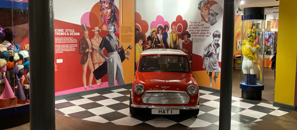
Following the logo design, Hartland’s next step was to design a visual language. It introduced a dual colour palette, three complementary typefaces and supporting graphic devices, and determined how images should be used.
Hat Works’ new visual identity works across print and digital assets, merchandise, exhibition graphics and interpretation, and interiors.
Like many museums, Hat Works doesn’t have the budget to outsource its ongoing design needs.
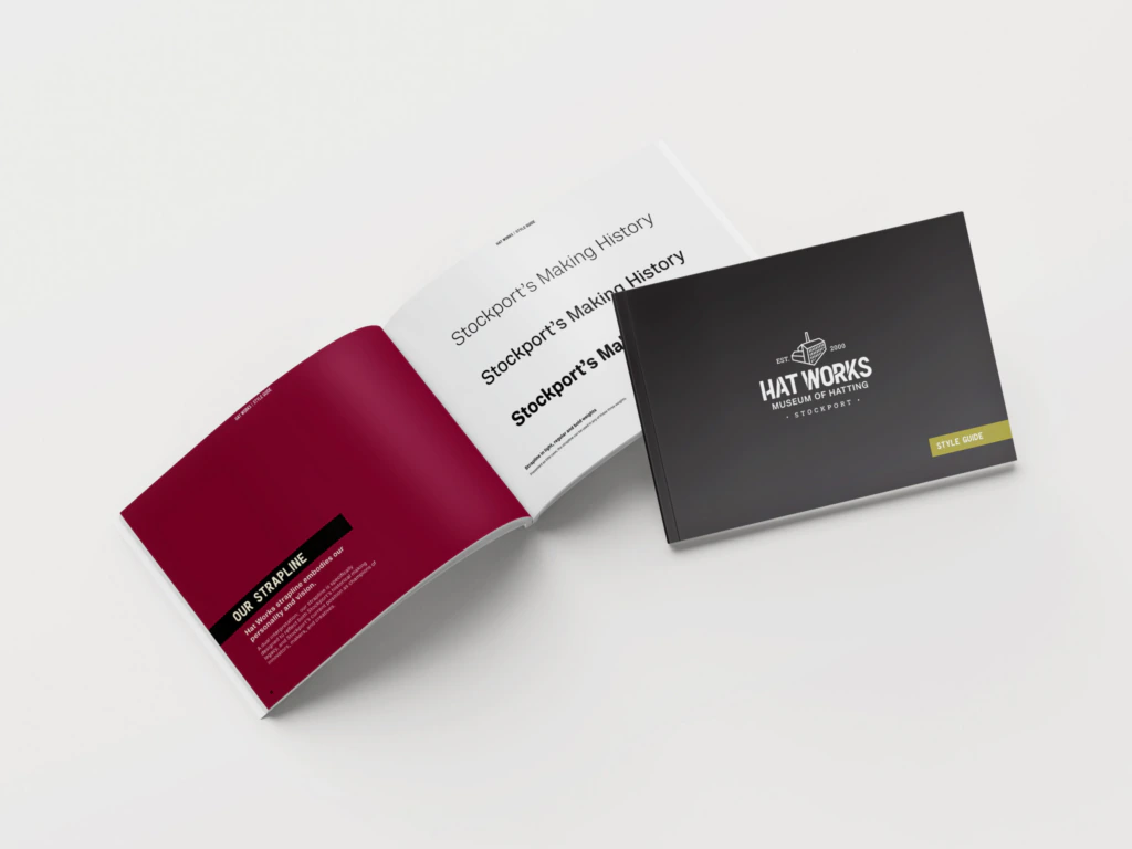
“To support this, we created a comprehensive style guide,” says Hartland. “It shows how to use the logo, colour palettes, typography, graphic devices and image treatments. The visual languages we design are usable, consistent yet flexible, and tailorable for different audiences.”
Bronwen Simpson is the museums officer at Hat Works