“Families” are a wide-ranging and variable group consisting of at least one adult (often a carer, parent or grandparent) and one child under the age of 16. But what engages a 12-year-old visitor will not necessarily appeal to their 21-year-old sibling.
So how do we create interpretation for families that is adult and child-friendly, and, crucially creates an experience that they can enjoy together? Conducting evaluations with visitors as part of exhibition development can provide some of the answers and slowly build up a picture of what works, what doesn’t, and the nuance in between.
Here are six evidence-based reflections drawn out from evaluations I carried out while at the Science Museum Group.
1. Create a good first impression
This is reassuring to families for whom the gallery is a space to enjoy. Evaluation of the Information Age gallery at the Science Museum in London found that families who immediately spotted an interactive on entering enjoyed their overall visit more than families who entered via another entrance where interactives weren’t immediately visible.
2. Integrate a variety of interpretation
Mix experience-based exhibits such as interactives with more static engagement, such as text panels. This gives all family members options and creates a shared learning environment that avoids separating the group.
Advertisement
3. Separate labels
Children or family trails have mixed success, with some families feeling that trails split the group, while others found them helpful for focusing attention. We learned that children enjoyed a trail developed for Medicine: The Wellcome Galleries at the Science Museum and found the points system rewarding, but parents felt it distracted from the experience of enjoying the galleries together.
4. Family-friendly text
Children rarely read text independently. Evidence suggests that writing text
for families makes it more accessible for everyone.
Five tips when writing family-friendly text:
- Use questions to generate conversations
- Deploy as many visuals as possible
- Text should be straightforward, concise and clear
- Tone of voice should be personal
- Answer key questions first
5. Create short films with a strong story
Films with people talking directly to camera do not appeal. Animations can help deliver information, particularly if the content is complex, but avoid anything too childish or styles similar to school videos. Remember to provide space to sit.
Advertisement
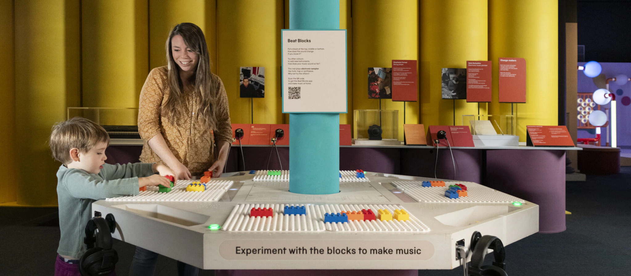
6. Design interactives that support social interaction
Successful examples have a challenge or creative promp, with clear feedback and even a reward. Ensure there is adequate space for people to gather, and pace these throughout an exhibition, to maintain interest. “Find out more” digital touchscreens have limited appeal to families, as they are not truly interactive.
There is always more to learn from our visitors about what engages them and what successful interpretation looks like. For example, touch objects tested well with families at the Science Museum but limited evidence made it difficult to draw recommendations.
As the evidence grows, we can continue to improve our interpretative practice.
Amy Davy is the interpretation producer at V&A East, and previously worked as interpretation manager at the Science Museum Group. This article is informed by summative evaluations carried out at the Science Museum Group.
To access the original reports, contact smgacademy@sciencemuseum.ac.uk. With thanks to Maria Serveta, the senior audience advocate at the Natural History Museum, who reviewed the summative evaluations
Concerning to see the title image for this piece: an interesting idea and an obviously expensive installation – yet the small boy has to have his arms at shoulder height to handle the coloured sliding blocks, and he still won’t be able to reach the back of the board. 150mm lower would have made it far easier for him (and any smaller children)
and given him a much better viewing angle of the board as a whole.
Most older ones would hardly have needed to bend to use it . . .
and this is in a major National Museum. How does such a basic mistake happen?
Perhaps even more disappointing is the choice of such an image in this context, with the inference that it illustrates ‘good practice’.